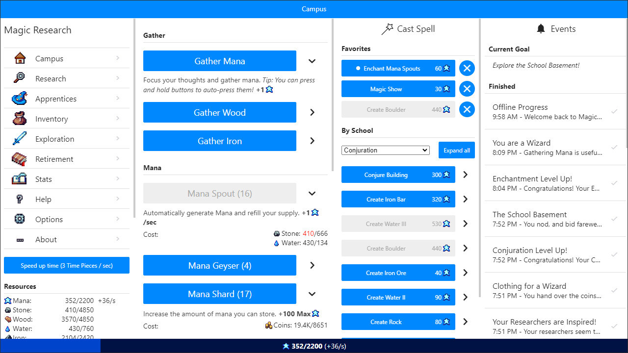
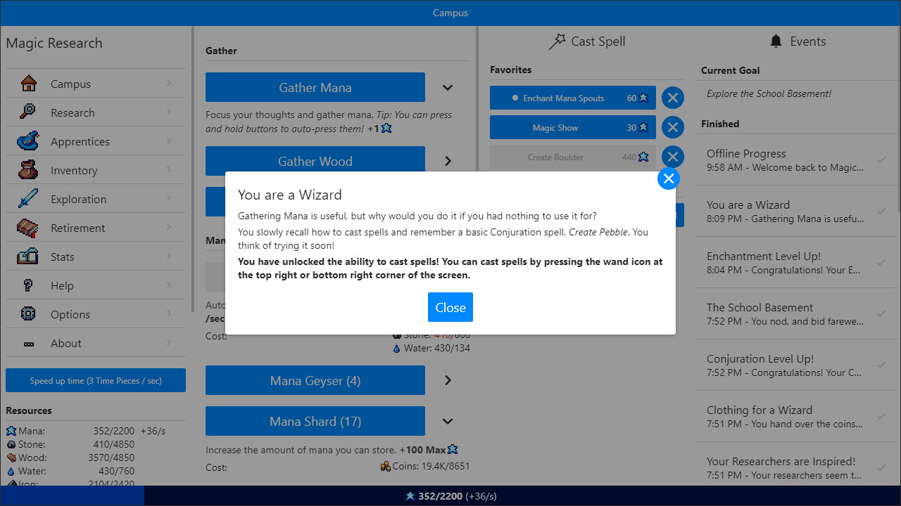
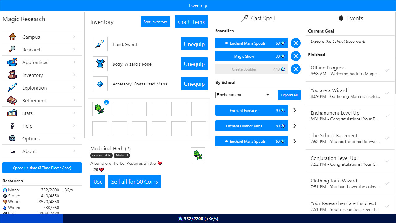
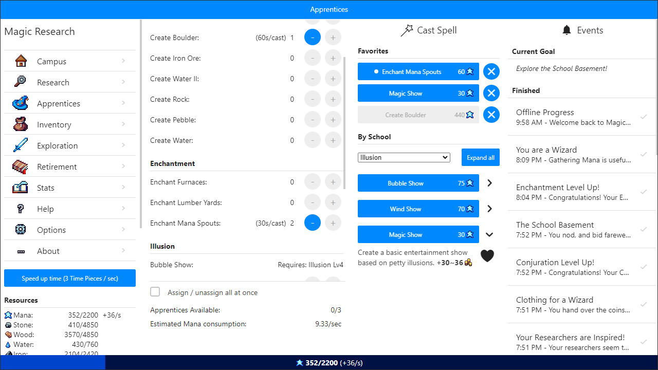
My review for this game is somewhat mixed Really solid progression/story mechanics and interesting combat/exploration system However this game is 5$ and the UI is far behind some 8 year old, completely free, zero microtransaction PC incremental games (such as Kittens Game and Trimps). It is very much a game meant for a phone/tablet touch screen and so the PC gameplay suffers. Despite the fact that it costs 1$ more on steam than it does on mobile The biggest thing the game is missing is tooltips. Most incremental games let you see a description of what a building (or spell) does, how much it costs, and how much of the resources you need for it in a tooltip. Instead in this game you have to click the right arrow button to decide what to buy, and also to reveal the button to add the spell to your favorites/quickbar. And then click it again to minimize it. This results in WAY more clicking than necessary. Would love if the dev added tooltips and put the heart icon to add to favorites/quickbar in the place of the right arrow The UI also made some obvious layout design choices around phones that aren't great on PC. There is a lot of wasted space causing you to need to use the mouse scroll wheel and click more than necessary. Many games have the buttons to switch between screens ran along the top, which would leave room in the left sidebar to show resources in a less tiny font, as well as see all the resources, combat stats, and buffs without having to scroll. Once you reach a certain window width it would be really nice if it showed 2 columns of buildings instead of just one super wide one. The notifications column could definitely have been kept as a flyout to allow more room for everything else. Also, if you use your full screen at 1080P or higher resolution, there is a massive gap on the apprentice screen between spell names and the + and - minus buttons for assigning apprentices. I had to narrow the window some once I started having 12+ spells in a single school or it was difficult to assign apprentices to the correct spell Other quality of life features that would be nice: saving the window size after you close the game; having some more hotkeys besides just the combat spells such as C for campus tab, R for research tab, etc Overall I do recommend the game for incremental and text based RPG fans. I just wanted to get some nitpicks out there on the mobile and unpolished state of the UI Edit April 9th: The dev has fixed a few UI complaints I had: They added a UI scaling option to the steam version. Alternating background colors on the apprentice assignment screen. The game remembers the state of whether your combat quickbar was opened or closed when switching away from the combat/exploration tab

Magic Research
by Maticolotto
Media
About This Game
Magic Research is a text-based incremental game about Magic. You are the headmaster of a newly-created institution of Magic. Will you be able to lead your school to win the prestigious Tournament of Magic?
What players are saying
Clearly I played this game enough to have to recommend it, but it does one of my least favorite things incrementals do these days: it goes from being an excellent incremental game to a laboriously slow RPG that requires heavy micromanagement. If you like incrementals, this is definitely a great one, but I feel like if it stuck to just being an incremental, it'd be one of the best of all time.
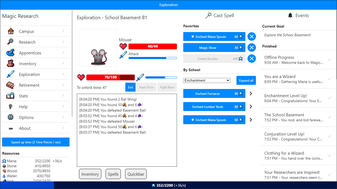
actually the more i think about this game the less i like it. It is WAY too exploration (what the game calls combat) focused, but exploration is limited by your gear, which is also limited by your exploration. As far as I can tell, the ways in which you can speed up exploration are very limited, so you're gated behind large amounts of waiting and boss fights that you have to micro manage on every NG+ that you do. The combat is interesting at times (you have to change your strategy/build to fight some enemies) but it mostly comes down to "wear the best gear" and "equip the accessory that prevents the condition." The last bit is particularly annoying, because it basically means you lose the accessory slot to fight already challenging enemies. So you gain nothing, lose an accessory slot, and the enemies are still difficult to fight. Why not just...not have enemies stun you for 5+ seconds so that the accessory isn't a must-have? NG+ generally doesn't do enough to warrant replaying ALL of the content again, so it becomes a huge time sink.
Reviews are by Steam users and hosted on Steam. Shown here with attribution.